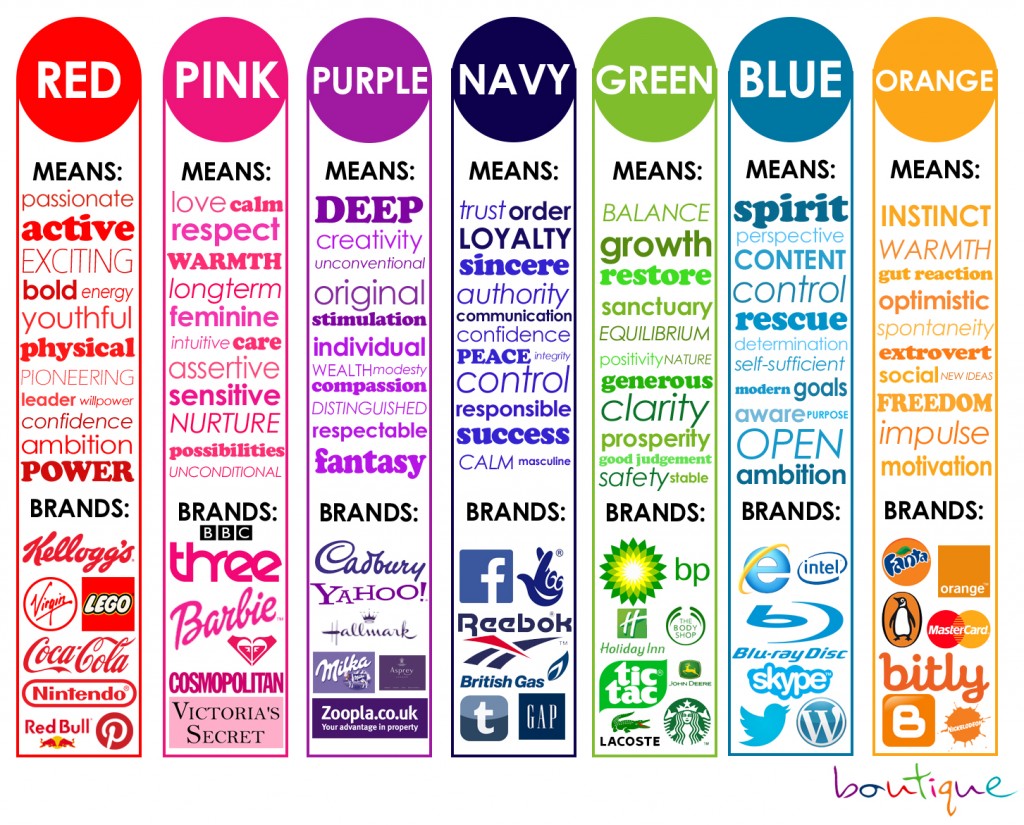
WRONG! There’s a whole lot of research done behind the meaning of colors!
When you think of your ‘Brand Identity’ what does that mean to you?
Personality is the emotional, and human, association to a brand. Identity is the image created and used by a company to relate to consumers. An identity can include all forms of communication and visuals such as logos, colors or fonts. But the two are symbiotic. A brand’s identity should be part of its personality.
This is one of our favorite color meaning charts: Attribution http://blog.visme.co/color-psychology-in-marketing-and-brand-identity-part-2/
When you talk about creating a brand it all starts with the colors, fonts, and styles.
Here are a few steps to get you started:
1. Mood Board Inspiration
What’s a mood board?
It’s a collection of different items that can help you get a feel of what your brand is all about. It can contain images, textures, patterns, typefaces, and other design elements. You may even put together a mood board with logos, website, images that you like the feel of to maybe replicate.
How to make an effective mood board:
Don’t set limits.
The moment you start making a mood board, understand that this is not a place for you to hold back. Put as many elements into it as possible. Remember that it’s always easier for you to take out elements that do not work out in the end. But if you hold back, you might miss out on things that you could have added, but thought twice about
Be detailed and specific.
Sometimes, you would add an image that struck you because of a specific element. A screenshot of a webpage perhaps, or a poster you found online. You may like the font used, or the color scheme applied. In these cases, make sure you add notes that specify what you liked about the image. This way, you can remember which element you should be zooming in on when you encounter the image in your board.
2. Color Palette & Fonts
Your brand identity is not just a logo of your business, but a reflection of your personality. When it comes to creating your brand, color plays a vital role in the process. People choose brands, make buying decisions, change their actions, choose what stores to go into, all because of COLOR, and they may not know they even do it!
Think of a stop light, you always know Red means stop, Green means Go and Yellow means caution or slow down, right? This changes the way we think about colors and what they mean to us as individuals. At the end of the day, Color is EVERYTHING! These colors will be in your logo, website, social media, print materials, publications, promotional items and so much more, it’s important you take your time and really think about this.
– What color makes you happy? What’s your favorite color?
– Which colors and fonts are you naturally drawn towards?
– Are there certain colors that can represent your design niche the best?– Which colors would you prefer to avoid?
-Are there certain colors that can represent your design niche the best?
-What do I want the identity of your business to say to my clients?
3. Logos
- Primary Logo—Size and Scaling The logos are all saved to paths—which means they are rendered as vector art and can be continuously scaled. When changing the size it is important to do this proportionally and not stretch the art or change the original proportions. The logo shall not be used below the minimum size shown below
- Primary Logo—Color Usage The primary logo may be used in four different color combinations as shown below. The logo should never be used in any other color combinations other than those specified below.
- Secondary Logo The secondary logo was created for situations where Highline is more of an endorsement or equal party. It can be used in situations where there is limited space or where the full name is not necessary. It may also be interchanged with the main logo if the name Highline Community College is stated elsewhere.
- Secondary Logo—Size and Scaling Like the primary logo, the secondary logo is saved to paths—which means they are rendered as vector art and can be continuously scaled. When changing the size it is important to do this proportionally and not stretch the art or change the original proportions.
Do you have one? Do you have a stacked logo for social media?
4. Social Media & Marketing Graphics
When you are creating all these graphics, it’s so important to make sure you have the right size for each social media platform, cheat sheet here http://www.visualistan.com/2016/12/the-2017-social-media-image-sizes-cheat.html
What social media platforms do you have, that you need to make sure your graphics are correct?
5. Website & Consistency
When communicating as the brand offline or via your website, social media profiles, or other online channels, it’s important to keep a consistent tone and personality. If your brand is fun and friendly on Twitter, it should have a similar flavor on Facebook and LinkedIn. Your messaging on LinkedIn may be less casual or more professional, but it shouldn’t sound like it’s coming from a different brand altogether. Think about it this way: there is the “at work” you and the “at home or with friends” you. Your personality is the same, but your mannerisms adjust to the context. The same goes for your brand personality and selected communication channels.
Is your brand identity unique?
Does it have passion behind it?
Is it consistent?


